National Park Site Redesign
Redesigning the Great Smoky Mountains National Park site to more easily plan a trip.

My bootcamp project was to create an add-on for a website. In initial research I found people who tried to plan trips to national parks found the website to be inefficient and confusing. I designed a way to quickly access the most sought after information without taking away from the information already displayed.
Problem
Planning a trip to a national park via their site is complicated and confusing. People should be able to easily navigate to, and between, the most valuable information needed.
Solution
Create an icon bar in the header of every page that allows people to navigate to the most sought after pages when planning a trip. This will shorten the user journey and increase use of the national parks website.
Tools
Voice Memos
Figma
Team
1 UX designer
My Role
UX research
UX design
Timeline
Overall: 6+ weeks
Discovery & Research: 2+ weeks
Design & testing: 4 weeks
Research
Surveys
Understanding the target audience and their challenges was my top priority. First, I built an online survey and shared it in various relevant communities. In just a few days, I received 21 submissions. Based on these, I identified five common areas of information sought when planning a trip to a national park.
Open ended & multiple choice question
21 responses
People seek information on reservations, camping, lodging, dog friendliness, and weather
This guided my design process and information architecture
Interviews
To understand the users in more depth, I prepared an interview script with 8 open-ended questions that focused on understanding our their needs when planning a trip and experiences using the national parks website. In one week, I recruited and interviewed five users remotely. I referenced the user interview findings throughout the entire design process.
My objective was to understand national parks visitors needs and current experiences on the website
I interviewed five people
I learned many people found the current website hard to navigate.
I used these findings to guide the information architecture and UI of the site.
“I only use the site for like 5 minutes and then I give up because I can’t navigate it very well.”
“It was pretty hard to figure out if my dog could come hiking… I had to click around a bit before I found the information.”
“I was led out of the website a lot and it wasn’t always easy to get back to where I left off.”
“By the time I was done making a reservation I realized I didn’t have a tab open for the park anymore and had to google it again to get back to the site.”
“Instagram did a better job at showing the best hikes. Talking to people was more beneficial as well.”
User Insights from the interviews.
“I know the site has all the information that I need but it’s easiest to find the right page in a google search.”
Personas
I created two personas based on user interviews and surveys, and kept updating them throughout the project as I gathered more data. I created these personas so I could easily step out of myself and into the user’s perspective.
I needed personas to keep the user at the forefront of my decision making process.
I used demographics from my surveys and interviews to create the personas.
I reflected back on these when considering information architecture and icon design.
Kyle is the primary persona because he most frequently uses the site to plan trips and activities.

Primary Persona

Secondary Persona
Sketches
My sketches were based on the initial user interviews and survey responses. They both pointed to the fact that the site was hard to navigate when planning a trip. I made sketches so I could efficiently decide on icon design before creating them in figma. I reviews the sketches multiple times to make sure they were easy to understand at a glance.
I created easy to identify icons to add to the header menu bar.
The areas of interest identified in the survey guided the icon choices
I chose the most simple representations of the categories

Icon Sketches
Wireframes
Using Figma, I translated my sketches into high fidelity wireframes. With the minimal adjustment made to the design I decided the value of low and mid fidelity frames did not outweigh the time required to make them. I then used the wireframes to created prototypes for moderated usability testing.
High fidelity wireframes
Created in Figma
Used wireframes for moderated usability testing

Wireframes
Usability Testing
I created a fully-functional, high-fidelity prototype of the new flows using Figam. At the same time, I started recruiting subjects for the test who fit my criteria. I conducted five moderated usability tests in the first round and identified two issues:
issue 01
Three participants noted a lack of apparent logic in the order of icons.
issue 02
A menu on the page titled “plan your visit” made participants unsure if they should click that or the icons.
Based on the feedback I made these changes:
solution 01
Without documentation to show how many people visit each page I was forced to assume the most visited pages and put the icons in order of most to least visited.
solution 02
I ensured everything that was in that menu was able to be easily found elsewhere and removed the menu from the icon bar.

Serves same function as icons
Removed redundant menu
Lack of apparent order of icons
Icons in order of amount of use
Home
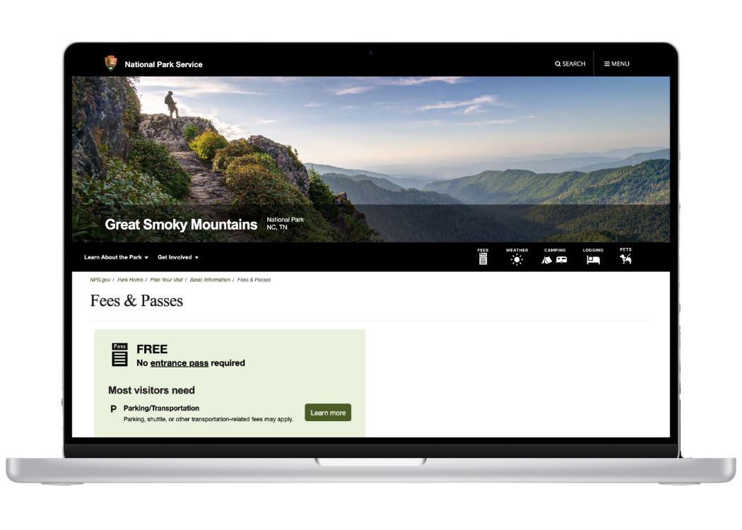
Fees
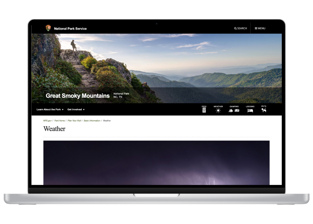
Weather
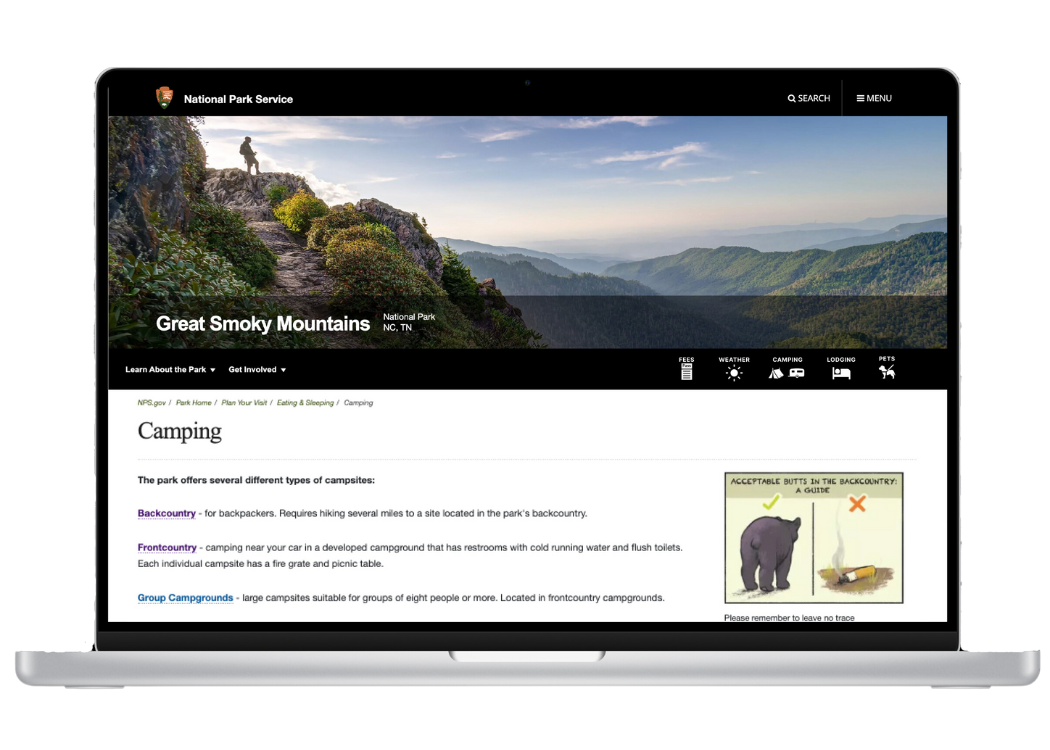
Camping

Lodging
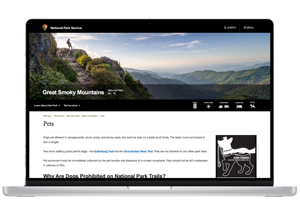
Pets
Next Steps
01
Review site analytics to assess user movement within the site and use of the icon bar.
02
Send survey to, or interview, users of new site to learn of their experiences with the icons.
Learnings
I learned a lot about creating vectors and icons in Figma, gaining more understanding of best practices with the pen tool and boolean tool.